Category Archives: Newport Beach

ooh on black

Mid Century Marvelous

.

I recently fell down the extremely enjoyable rabbit hole of researching this piece and after reveling in all that is Mid Century for several weeks, hardly know where to begin.

As a teen and young adult, the style was not high on my list of favorites.  Two or three decades after it’s heyday, it just looked “old” or “dated” and perhaps something my parents might have liked.  But “sooner or later, everything old is new again.” and I’ve come to love the mid-century style.  Walls of glass, clerestory windows, flat planes, the blurring of lines from indoor to out, and organic materials in the open spaces all beckon to me as a place where I’d want to live.  The style is iconic but far-reaching, and many different tastes can be satisfied within this style of homes built primarily between 1940 and 1970.  Many Mid-century houses utilized then-groundbreaking post and beam architectural design that eliminated bulky support walls in favor of walls seemingly made of glass.  Mid Century Modern is not just a trend popularized by Mad Men, although the show definitely sparked new interest as well as reminding many of their love for this style. It is a significant design movement, propelled by the amazing minds and talents of designers and architects such as Charles & Ray Eames, George Fred Keck, his brother Willam Keck, Henry P. Glass, Ludwig Mies van der Rohe, and developer Joseph Eichler.  Oh, so much to share with you, so much to learn! If you have a few weeks to spare, I highly recommend venturing into your own research of this style.

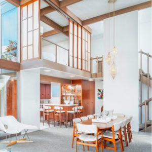
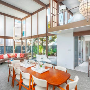
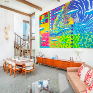
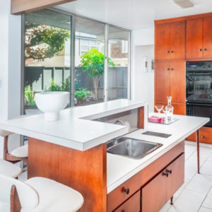
A house properly designed will have a certain intangible “feel” to it. When the proportions of a room are correct, you know it without knowing it. When the site is thoughtfully considered to the building itself, it makes such a huge difference as opposed to “Plan B-reversed” plopped down every 4th house, regardless of where the sun rises or the breezes come from. One home that I really enjoyed spending time in recently was 44 Palermo Walk on Naples Island in Long Beach.  Designed by architects Power and Daniel, this original Mid Century is elegant by design. The clean lines and soaring great room ceiling have the perfect feel to them. The house is on a slightly wedge-shaped lot, which adds interest to the focal-point courtyard. The house is L-shaped with the garage at the rear, accessed by an alley. The water is super close and there’s a little park just a block away as well. The neighborhood is typical beach-tight but missing all of the frantic-ness of a tourist-destination type of beach. Inside the house or in the courtyard, all you feel is a peaceful oasis.  The lack of clutter, both architecturally and possession-wise is refreshing and calming.  I loved the bar and it’s original accouterments (built in blender base!) and immediately began planning my next cocktail party, but I would want to change out the countertops and appliances. The layout was great, with the kitchen accessible and open to the great room, but just a little tucked away in case it isn’t super tidy. One wall of the kitchen was a sliding glass door to the courtyard, making barbecues a breeze. One of my favorite features of this house was the bigger of the two master suites upstairs.  This room could look over the great room in a loft-style way, or have privacy simply by sliding the built-in shoji screens to open or close one wall of the room!  I loved this feature!  If I had a magic wand to wave to make this home a perfect 10 hearts, I’d be adding a fireplace in the living room, bringing the laundry in from the garage (there’s a perfect storage hallway behind the kitchen right next to the downstairs bathroom). updating the kitchen counters and appliances, and modernizing some of the behind-the-scenes things like plumbing and electrical, just to ensure a long and happy future with this dream home of the 60’s.  As it currently stands, 44 Palermo Walk is a swanky 8-1/2 hearts.

8 and a half hearts

two story great room. sliding screens can open up or close off the master bedroom above.

two story great room. sliding screens can open up or close off the master bedroom above.

another view of that fabulous feature

another view of that fabulous feature

everything in the right proportions, including the artwork

everything in the right proportions, including the artwork

love this bar at the side of the kitchen!

love this bar at the side of the kitchen!

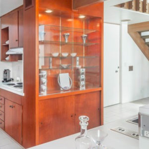
beautiful display cabinet for a well-stocked bar or just display

beautiful display cabinet for a well-stocked bar or just display

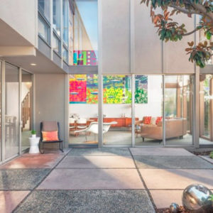
peaceful and private courtyard

peaceful and private courtyard


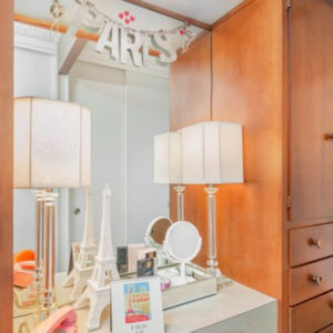
built in dressing area in the master bedroom

built in dressing area in the master bedroom

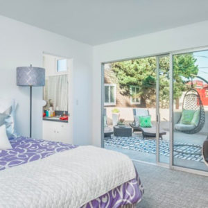
the "second master" with it's spacious deck

the “second master” with it’s spacious deck

striking in it's simplicity

striking in it’s simplicity

Mid Century Modern homes do not have to be campy time capsules, full of shag carpeting and kitchens wallpapered with pictures of mushrooms or sunbursts.  True, some are lovingly preserved in their original splendor. That seems especially prevalent in areas where there are entire tracts of these architectural gems and the owners tend to fiercely protect the originality of the home and the neighborhood, such as the Cliff May Ranchos in Long Beach or the Fairhaven Eichlers in Orange. MCMs who don’t share that same safety in numbers are often more updated over time to keep up with the Joneses. They keep their mid-century roots but may be more modern in amenities or finishes. Many are fresh, crisp and feel as new as the day their first family pulled up in a brand-new 1964 Plymouth station wagon.

Below are a few of my favorite Mid Century Moderns on the market today.

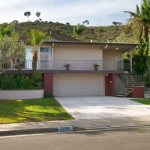
31741 Grand Canyon Drive in Laguna Niguel.  Very classic, well maintained, and plenty of room in the price to do even more updates.

oh-grandcanyonii1 oh-grandcanyonii3 oh-grandcanyonii4 oh-grandcanyonii5


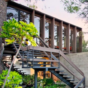
2867 Belden Drive in Los Angeles. Commercial-looking from the outside, (which I loved), modern, yet classic inside.

oh-belden1 oh-belden2 oh-belden3 oh-belden4


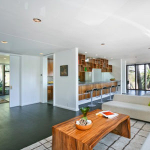
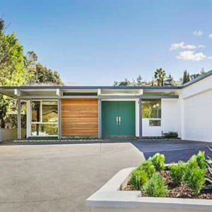
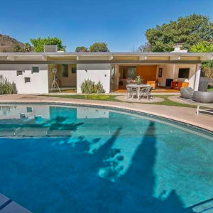
7536 Kimdale Lane in Los Angeles. Taking a page straight out of Palm Springs architecture with flat roof lines, a gorgeous yard and pool, and a fabulous turquoise front door. This house was a well-executed mix of current and classic.

oh-kimdale oh-kimdale2 oh-kimdale3 oh-kimdale4


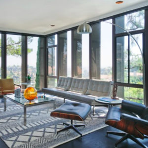
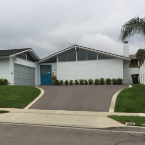
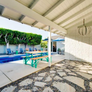
4720 Cortland Drive in Corona del Mar. This home is has the classic clerestory windows to grab your attention from the street as well as a turquoise dutch door into the courtyard. Do you know what I love more than a courtyard? That’s right, a courtyard with a pool! This house has it all, with a fresh, fun, welcoming feel and abundant space and light.

oh-cortland1 oh-cortland2 oh-cortland3 oh-cortland4

Mid Century Modern is honest and sophisticated, but never pretentious. One of the defining tenets of this style of architecture is that a fulfilling, healthy life begins at home. The very design of the homes encourages you to connect with your environment as well as those you share the home with; ideas that may have been ahead of their time in the middle of the 20th century, but are so crucial to healthy happy living today.

I again urge you to learn more about this fabulous style. If you really want to bathe yourself in Mid Century Modern, look into Palm Springs modern architecture.

See you at the bottom of the rabbit hole,

Ophelia

ooh on black

Community spotlight: Corona del Mar

.

A.K.A. a love letter to my town.

Ophelia has so many loves. One of them is the town of Corona del Mar in Newport Beach, California. Until the late 1920s, Corona del Mar was a tiny village, reached from the peninsula by small boat at high tide, or by a muddy dirt road that crossed over the Irvine Ranch. Now Corona del Mar, which means “Crown of the Sea” in Spanish, is part of the City of Newport Beach, but has it’s own zip code and it’s own Chamber of Commerce, as well as a representative on the Newport Beach City Council.

Corona del Mar is small, approximately 3 miles by 3 miles, fronting along the beautiful Pacific Ocean. I love how our beaches are backed by cliffs, providing spectacular views to those above.

One of the many reasons to love Corona del Mar is the spectacular weather. On average, there are 278 sunny days per year. The ocean breeze keeps us comfortable, perhaps too comfortable! Many of us are so spoiled by this perfect weather that a hot spell (90°!) for 3 or 4 days drives us indoors to our almost-never-used air conditioning.

The topography provides variety and interest. The village isn’t flat and boring. There are hills and slopes, as well as steep cliffs and canyons. At the base of the deepest canyon is Bayside Drive, which runs basically parallel to Pacific Coast Highway.  Within the Village, there are 3 areas as far as real estate is concerned. North of the Highway (the inland side), South of the Highway (the ocean side), and South of Bayside (this basically means you are within 3 blocks of the beach.)  The Village is also referred to as “The Flower Streets” and the streets are laid out in a basic grid pattern and botanically-named alphabetically from Avocado to Poppy, traveling East to West.  Of course, we have our quirks (I’m a big fan of quirks), as there are 2 A’s, no E or K, and 2 M’s, and 2 P’s. We stop at Poppy but then add on Hazel. It’s all very fun, but personally I would have named that last street Queen Anne’s Lace or I would have skipped the Q and gone straight to Rose.

The houses aren’t boring either. Every one is unique and original. There are very few actual original cottages (less than 5, probably) built before the 20’s. The majority of what is considered “original” was built in the 40’s.  Most of these have been developed into duplexes, with a “back unit” over the garage.  Newer construction comes in all styles from Cape Cod to Mediterranean to Modern Farmhouse.  Many of these homes also take advantage of the R-2 zoning prevalent in the village and are built as two units.  Instead of remaining as a duplex where one party owns both units and rents one out, they have been turned into condominiums and sold off separately.  Lot sizes are typically 30′ x 118′ and built out as much as the law will allow.  Beach town living often means being 6′ from your neighbor’s kitchen window.

CdM is a walking village.  The businesses are clustered along Coast Highway and nearly everything you need is within walking distance if you live in the Flower Streets.  Banks, Coffee, Hair and Nail Salons, the Post Office, the Hardware store, the Grocery store, the Drug store, Real Estate offices, and of course, shopping and fine dining! You can grab a breakfast burrito, get your shoes re-soled, pick up your dry cleaning, scope out some flowers, admire some artwork or beautiful furniture, and make a stop at See’s before heading home. You can shop for a new cell phone, see your personal trainer, get frozen yogurt, or stop for wine and cheese – all without getting in your car.  In the late 40’s, my mother used to work at the soda fountain in the town drug store. It was located right in the center of town at Marguerite and Pacific Coast Highway, where Berkshire Hathaway is now located.  Her boss lived just a few blocks up Marguerite and she said that she and her co-workers could see him walking back down to the drug store after his afternoon nap and knew it was time to stop goofing off!

Of course there are other areas to Corona del Mar besides the village. Irvine Terrace, Cameo Shores and Cameo Highlands, Shorecliff, Jasmine Park, Harbor View Hills… These are beautiful neighborhoods in a more traditional “suburbia” kind of way. The lots are bigger, streets are wider, houses have a little more room to breathe, but you do lose the walkability.  Residents here still benefit from the gorgeous weather and the close proximity to Fashion Island and activities of the village. And of course, all property owners in Corona del Mar enjoy a high return on their investment! Property values in Corona del Mar increase faster than other areas and hold their value better through the tough times.  There’s definitely a wide variety of real estate here, from condominium complexes to front or back units in the village, to single family homes to breathtaking mansions, often all in one block!  I think it’s the variety that I love the most. For this article, I searched high and low for my favorite property currently for sale in each of 5 different price ranges.

In the $1M – $2M range, I found that you can still have quality finishes and all of the benefits of CdM, but you may sacrifice a little in the “location” department.  Especially in the lower half of this price range, most were back units or located extremely close to Pacific Coast Highway.  I settled on 1433 Keel Drive as my favorite.  Located in Harbor View Hills South, this lovely home was built in 1969 and has been tastefully remodeled into a beautiful and serene oasis. The neighborhood is quiet yet close to Fashion Island and convenient to either the beach or the freeway.  I loved the leaded glass windows in the living room and the high ceilings. The house has an airy, spacious feel to it.

In the $2M – $3M range there was less disparity between the highest price one and the lowest price one than there was in the previous category.  All were either lovely or a great opportunity, so it really came down to personal taste. 712 Fernleaf Avenue was my personal winner. I loved the modern, sleek appeal, the finishes that had been chosen, and the fabulous roof deck. No, I’m not a fan of the bathtub in the master bedroom, but I do love that the owner was true to herself and built it for the way she wanted to live.  I would actually feel a little guilty changing it, but yes, I would change it. The back unit here (712 1/2 Fernleaf) is also for sale and I’d LOVE to have both.

Between $3M and $5M you can have your choice of styles and locations. You can be in the village or the neighborhoods and you will generally get over 3,000 square feet, unless you’re in a really, really prime location.  There were so many gorgeous homes to choose from and a lot of variety. I found my favorite in the village, South of Bayside. 320 Iris Avenue is on a dead-end street, so it is a pretty quiet location, but still close to everything and only 2 blocks from the beach.  This house has great architectural appeal. The rooms are interesting, not boring boxes.  Finishes are high quality and well-thought out.  One of my favorites was the brick wall behind the bathtub.

In the $5M – $10M range, I found myself gravitating toward Irvine Terrace. (I actually have one I love more down in ShoreCliffs but it’s already sold. You can read about it here.)   There is, of course, a ton of luxury to be found in this price range, so it really does come down to personal taste.  Dolphin Terrace is a coveted street, but the other side, with the ocean and harbor views, can be nearly twice the price per square foot. I fell in love with 1536 Dolphin Terrace, on the inland side of the street.  This is a very current/fresh feeling modern farmhouse with glossy shiplap walls and reclaimed wood. In addition to an ideal neighborhood and tons of space, the outdoor space is SO inviting and so easily accessed from the indoors. One of my favorite features was the kitchen ceiling with it’s inset portion of reclaimed wood.

Finally, the ever-so-important category of $10M and up.  Helloooooo, gorgeous! There are currently only 7 properties for sale in Corona del Mar with a price tag of over $10M.  But that’s mostly due to the time of year. In this range, there are lawns that look like green velvet, Master closets that look like Neiman Marcus, bars that look like they belong in a hotel, and wine rooms straight out of my dreams. It was difficult to narrow these 7 down to just one winner. The most expensive one ($24.7M) was very tempting but I’d also want to do a great deal of updating. What it really had going for it was location and size. The “second cheapest” one (nearly $12M) had my favorite finishes and design, especially the bar and wine room.  But my winner is 2735 Ocean Blvd. There was a great article written about this house a little over a year ago.  The originality of design and the unparalleled location are what moved this house into first place for me. I’m fortunate enough to walk past this home a few times a week and one of my favorite features from the outside is also one of my favorite features of the interior as well – the natural limestone block walls. There are imprints of shells in each block and it is so perfect for the location, yet elegant and timeless.  There is one factor, however, that seals the deal for me and firmly roots this home as my favorite in Corona del Mar.  When the iconic “Chinese House”, for which China Cove was named, was about to be torn down in 1986 after watching over the harbor for 60 years, the owner of 2735 Ocean tried to get them to save it. When they demolished it anyway, he procured large portions and incorporated them into his own house. The Chinese house lives on at 2735 Ocean, with a tile roof, the wood corbels with gold leaf painted dragons and copper horns. I have great respect for a man who felt such a connection with a home in his community that he not only kept portions of someone else’s house, but also included an inscription about the history of China Cove for future generations to read and learn.

I love Corona del Mar and all it has to offer, and happily give this community 10 hearts out of 10. ♥️♥️♥️♥️♥️♥️♥️♥️♥️♥️

Below are some of my favorite CdM places.

little corona and arch rock.

little corona and arch rock.

tea in the courtyard of sweet lady jane.

tea in the courtyard of sweet lady jane.

the side door. charming english pub on the side of 5 Crowns

the side door. charming english pub on the side of 5 Crowns

a bike ride to pain du monde is always a great morning

a bike ride to pain du monde is always a great morning

not technically in Corona del Mar, but the shops and restaurants of Fashion Island are part of what make CdM so great.

not technically in Corona del Mar, but the shops and restaurants of Fashion Island are part of what make CdM so great.

beautiful blue skies, flowering trees, and our statuesque palm trees

beautiful blue skies, flowering trees, and our statuesque palm trees

beautiful sunsets year 'round, but especially in December and January.

beautiful sunsets year ’round, but especially in December and January.

another perfect sunset

another perfect sunset

striking beachfront modern home

striking beachfront modern home

blooms. the perfect flower stand to pop into any time you feel a little happier

blooms. the perfect flower stand to pop into any time you feel a little happier

oh, these sunsets

oh, these sunsets

a game of croquet in Begonia Park as the sun sets

a game of croquet in Begonia Park as the sun sets

goldenrod footbridge. always fun, but never a more welcome sight than if you're running the Corona del Mar Scenic 5K. The finish line is just on the other side!

goldenrod footbridge. always fun, but never a more welcome sight than if you’re running the Corona del Mar Scenic 5K. The finish line is just on the other side!

take a book, leave a book. positioned strategically around town.

take a book, leave a book. positioned strategically around town.

Whenever I tell people I live in Corona del Mar, they always say “oh, I love Corona del Mar” and they don’t even live here!  Imagine how much they’d really love it if they’d experienced the CdM life themselves.  Are you ready to join us in paradise? Give Ross a call!

Ophelia


ooh on black

Deal-Breakers

.

Deal Breakers…  You know, the non-negotiables.  You’re on a first date and getting to know the person when they happen to mention that they stabbed their ex with a kitchen knife over a burnt piece of toast. Deal Breaker. Or you go to an Open House that you’re really excited about because it’s totally in the price range and the style of the house is just so you. But then you arrive and find out that the back yard is all of 5 feet deep and on the other side of that block wall is the 405 freeway. Deal Breaker.

I showed some pictures of a gorgeous kitchen to a friend of mine.

blog - 1

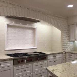
It was huge, with acres of quartz counter tops and a tiled-in brick arch over the expansive cooking area. She loves to cook and I thought she’d dig it.  She agreed it was pretty but said “I can’t stand to have my back to everyone when I cook. I need to be able to see everyone.” What I thought was a selling point was actually a deal breaker for her.

For my father, noise is a deal breaker. If it’s too close to the flight path or a busy road, he’s out. For me, insufficient closet space or ill-placed laundry are certainly going to give me pause.

But in reality, actual Deal Breakers are few and far between. If you love the house enough, there’s are aspects you’ll overlook. Maybe it’s selling for a great price in that school district you’ve been dying to get into. You can probably live with the 80’s kitchen for a while if the other features are great.  So what are they called if they aren’t Deal Breakers? Affection Dissipators? That doesn’t really roll off the tongue. Let’s call them Stumbling Blocks.

Your Stumbling Blocks will weigh into your overall feeling toward the house.  If there are enough great selling points tipping the scales in the other direction, your stumbling blocks may feel minimized.  In the “three I’ve truly loved“, two of them had laundry rooms inside, one did not.  The one that didn’t had so many other selling points that I was willing to overlook it. The other two definitely checked the box of “inside laundry room” and one was such a dream (huge and right next to the master closet) that it was one of the positives tipping the scales away from any Stumbling Blocks. (For the record, I can’t think of a single Stumbling Block on that one. My father didn’t like the airplane noise but I was so enchanted I couldn’t even hear it.)

420 Osgood Court in Laguna Beach is a true charmer. Great style, wonderful location, quality finishes, interesting features…  I’d seen the online pictures and thought “what a great price for a place so close to the beach in Laguna!” so I had to hit the Open House. I found Osgood Court, parked nearby, and instantly loved the exterior. Horizontal, varnished wood siding, with a concrete planter made it feel modern, clean, and well-executed.  Inside was no let-down, either. The kitchen was white with marble counter tops, frosted glass doors, and a subway-tile back splash. The cooktop faced the living room and the farmhouse sink looked out a window. The house is small, but friendly and efficient. The house had a wonderful feel to it. Such an intangible, but so important. It was very peaceful and relaxing to be there.  The current owners very cleverly turned a screen porch into an open-air office, and there was a small but private and tranquil outdoor space. Originally just a 1 bathroom, they carved out enough space to add a powder room. Phew! For me, a 1-bathroom is an actual Deal Breaker. I may still look at a 1-bathroom house, but if I can’t find a place to add at least a powder room, I’m out. Then, of course, I had to ask… “Where is the laundry?” The answer broke my heart a little. It was outside, facing the carport/parking space.  They’d enclosed it nicely, with the same wood siding as the house.  Truly, everything was well thought out and top notch on Osgood, but I just couldn’t with that.  I had to move on.  This house is a perfect vacation home, or great for a single person or couple who don’t share in my laundry hang-ups. The everyday living is relaxed but refined and I love the green walls. I loved the exterior, the obvious high quality work they’d put into the place, the floors, the kitchen…  The scales began to tip a bit simply due to the small size (970 square feet) but the outdoor laundry (and literally no way to move it in) was unfortunately the deal breaker, and the heart breaker.

Cute little Osgood Court gets 7 hearts from me. ❤️❤️❤️❤️❤️❤️❤️

kitchen and front door beyond. great finishes and efficiency!

kitchen and front door beyond. great finishes and efficiency!

view from the kitchen into the living room and toward the yard.

view from the kitchen into the living room and toward the yard.

the back yard. wonderful place to relax and barbecue

the back yard. wonderful place to relax and barbecue

the bathroom. if there can only be one shower, it's nice to have this kind of quality!

the bathroom.   if there can only be one shower, it’s nice to have this kind of quality!

parking space and laundry behind those hinged doors. :-(

parking space and laundry behind those hinged doors. :-(


700 Poppy certainly did not have the issue of being too small! This is a gorgeous “modern farmhouse” home of nearly 2400 square feet. The Deal Breaker for me was the floor plan.  I’d looked at this house online, loved it, and couldn’t wait to go through the Open House.  It’s at the top corner of the village, backing to Buck Gulley, with views toward the ocean as well. Oh, I was so excited to see it in person! The house is 3 stories, with the garage being the middle level. As you enter from street level and a spacious front yard/patio, you find yourself in a huge and beautiful kitchen, with high ceilings. There is an eating bar for 3, which is where you would likely have 100% of your meals.  The living and dining rooms were a half level above the kitchen! I cannot imagine anyone carrying their dinner up 7 stairs and running back down to get the salt, butter, or seconds. This was a huge design flaw, in my opinion.  Also on the street/entry level were the powder room and (I think) the laundry room. I was so thrown by the inconvenient dining room that I wasn’t paying much attention to the laundry. (Weird, right?) Above the garage was a bedroom with it’s own bath. All of the highest quality finishes and capturing a nice view of the village.  The master suite was a half level down from the kitchen and entry. Oh, the master suite!  I would spend all of my time here. The bathroom was huge and luxurious, and not only was there a big tub (with a lovely light fixture above) in the bathroom, but there was a second soaking tub out on the balcony!  The balcony called to me to spend endless hours out there, looking over the lower part of the yard and into Buck Gulley. On the lowest level was another bedroom, a great flat yard with adirondack chairs and a fire pit, and an office or sitting room.  I was baffled by this. Why wasn’t it a bathroom?  Whoever lives or stays in this bedroom has to come up 1-1/2 flights of stairs to simply use the powder room.  If they want to shower, they have to go up another flight of stairs and through someone else’s bedroom! This made zero sense to me. Perhaps it’s an easy fix, to turn the office/sitting room on the lowest level into a bathroom for that bedroom. There’s certainly space for it. I just can’t understand why it wasn’t constructed that way in the first place.  I wanted SO much to love this place – it was absolutely gorgeous, in a great location. But all of the ups and downs left me feeling down and the layout was just a Deal Breaker for me.

It’s difficult to assign hearts to Poppy because the location and quality are so great, but the layout is so inefficient if you have more than 3 people living there. It kills me to only give this beautiful house 7 hearts, but 8 just seems too high.  7-1/2 hearts for 700 Poppy.

7 and a half hearts

beautiful kitchen. that backsplash!

beautiful kitchen. that backsplash!

living room with nice west-facing clerestory windows.

living room with nice west-facing clerestory windows.

dining room. pretty, but unfortunately far from the food.

dining room.  pretty, but unfortunately far from the food.

secondary bedroom at the front of the house

secondary bedroom at the front of the house

make a choice, master bath straight ahead or turn left for the balcony

make a choice, master bath straight ahead or step out onto the balcony

love the balcony bathtub!

love the balcony bathtub!

the master suite balcony has a view of the yard below

the master suite balcony has a view of the yard below

What’s on your list of Deal Breakers and what’s just a Stumbling Block? What can you simply not live without and what would you rather not sacrifice? Share your thoughts in the comments below, or give Ross a call to discuss and let him find you a home where you won’t have to compromise!

Ophelia

ooh on black

Details, Details!

.

When it comes to houses, there are the big things – like location, price, size, and floor plan – and then there are the details.  Ah, the details.  Small by definition, but they make such a big impact.  There is the general rule of thumb that as the price increases, so do the details, so the exceptions to the rule are always a refreshing find in an open house weekend.

Have you ever just raced through an open house because there is literally nothing to look at? Square or rectangular rooms, flat ceilings, ho-hum closets, boring bathrooms…  No chances taken anywhere, architecturally or design-wise. Maybe the materials are nice but the same in every room, and the same as the last house, and the one before.  You turn corner after corner hoping for a bit of life, but… *sigh*… flatline.

By contrast, there are houses where you hardly know where to rest your eye. This doesn’t mean they are busy or even cluttered, it just means that there are details.  Even in a sleek, modern design, there can be thousands of exciting details. When I fantasy shop (in the $38M range) (what, doesn’t everyone do this?) there are usually multitudes of heavenly details. Take a look at this listing for 1201 Laurel Way in Beverly Hills. Go ahead and try to pick a favorite feature. I dare you.

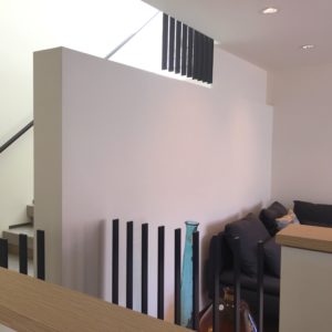
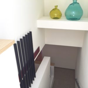
In a slightly more reasonable price range, I have two to share with you.  (And again, if $38M is reasonable to you, call me, we need to hang out.) One property I visited that boasted great attention to detail was 3240 Broad Street in Newport Beach; two newly constructed townhomes, identical but reversed, in the Newport Heights area. These contemporary dwellings, designed and built by architect Renato Trotta, are each 1900 square feet of quality details. The materials used have variety, but a thoughtful repetition. For instance, the exterior window ledges match the patio below to give a sense of continuity. The kitchen has a limestone floor while the living and dining are both wood. They come together on a graceful angle, giving a feeling of “custom” not “builder”. There is a brushed marble hearth, raised to an appropriate sitting height  (a must, in my opinion, so that you can sit right by the fire). This hearth shares that same angle, and actually “floats” a few inches away from the fireplace. The outlets in the kitchen are not in the backsplash wall, but are actually up in the bottom of the upper cabinets: convenient and accessible, but discreetly hidden from view. There are no baseboards in the house. The drywall hovers just above the floor.  You simply can’t pull off this look unless your drywall work is of the highest quality! One of my favorite features in the house are the openings in the walls. At the end of the galley kitchen there is an opening to the staircase leading upstairs and toward the garage. It removes the “trapped” feeling one might experience at the end of the kitchen, and creates a feeling of connection to the rest of the house. Upstairs in the loft, there is a pony wall around the staircase coming upstairs, capped in the same light wood as the rest of the cabinetry in the house. This wall stops and becomes a metal railing for about 30 glorious inches, consisting of only vertical supports, no horizontal top! It’s delightful and unexpected and pops up in a few places throughout the staircase area.  It’s difficult to do it justice in words. Be sure to check out the listing or this video. You will marvel at the detail in this home – variated ceiling heights, cut-outs in the drywall above each and every stair, showers with a gentle slope toward a stepped-down drain, the raised walkway in the garage toward the hidden laundry. You know how I feel about garage laundry, but they did the best they could in this situation. Because of the orientation of the laundry, and the smartly placed wall, you don’t feel that you are really in the garage doing laundry, and when you drop your clean socks on the way back in the house (arghhh!) , at least they aren’t on the garage floor.

I love the feeling of quality in this home. I love the surprises and the details. I wish it were just a tiny bit bigger, if for no other reason than to get the laundry inside (and possibly upstairs). There’s a little bit of up and down with the layout of the stairs between the garage and powder room and the rest of the house, and the neighborhood is a bit transitional (but still boasts a fabulous ocean view)  but those were really my only drawbacks. The two homes really are spectacular and special and unique. You don’t often find quality like this in new construction unless you’ve built it yourself. I give these Broad Street townhouses 9 hearts out of 10.  ❤️❤️❤️❤️❤️❤️❤️❤️❤️

living room fireplace and floating hearth

living room fireplace and floating hearth

you can see a speck of the wall-opening toward the entry area at the end of the kitchen

you can see a bit of the wall-opening toward the entry area at the end of the kitchen

master bath. there are these wood-capped ledges throughout the house. great details.

master bath. there are these wood-capped ledges throughout the house. great details.

loft area and stairs up to the roof deck

loft area and stairs up to the roof deck

skylight-lit stairwell down from the ocean-view roof terrace to the second floor loft and bedrooms.

skylight-lit stairwell down from the ocean-view roof terrace to the second floor loft and bedrooms.

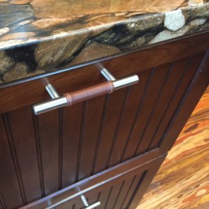
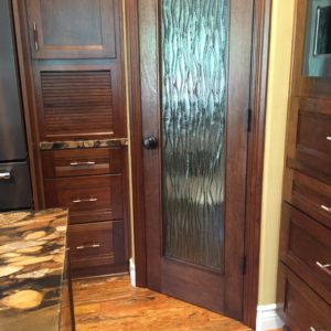
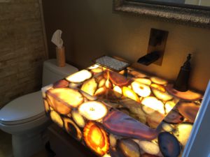
The second house of the weekend whose details drew me in was 2633 Orange Ave. in Costa Mesa. Built in 1999 and impeccably maintained, this home is the epitome of move-in ready. There are designer touches throughout and the outdoor space is incredible. There are 16 feet of slate walls of water and greenery covering every other surface. The family room glass pocket doors vanish, causing indoor and outdoor to easily mingle. If you want a screen to keep bugs out or pets in, one appears from the ceiling like magic. The kitchen has a great layout, with room to work, lots of counter space, a walk-in pantry, and room for two people to cook. The surfaces chosen are surprising and interesting. There’s nearly a cacophony of patterns with the dotted backsplash, the unique circle-pattern granite, and the multi-color “mardi gras” floor, but somehow it all works. There are leather-wrapped cabinet pulls and a wavy glass door on the pantry.  Every bathroom except the master had the same layout, but each had it’s own unique materials. Downstairs the sink was very dramatically lit from inside, causing the stone to glow! This glowing stone was also featured in an eating bar between the kitchen and the dining room. There was a beautiful carved door into the garage as well.  It is evident from the neighborhood that the nine houses on this cul-de-sac were all built at the same time, falling into that “builder home” category.  Once inside this lovely home, it feels completely custom, adored and celebrated by it’s owner.

I loved the layout of the home and the well-chosen, high quality details.  If I were making wishes, I would wish it were a little farther from the airport, with a little more exterior space in both the community and the yard, and I wish the exteriors weren’t quite so… “faux mediterranean”. They aren’t un-attractive, but it’s not my favorite style.  I would also wish for a fireplace, although there is a gas fire pit outside. Even with my wishes un-granted, it earns an easy 8 hearts. ❤️❤️❤️❤️❤️❤️❤️❤️

leather-wrapped cabinet pulls!

leather-wrapped cabinet pulls!

appliance garage in the cabinetry. pantry with custom glass door

appliance garage in the cabinetry. pantry with custom glass door

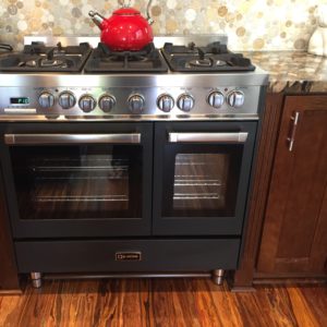
viking stove, surrounded by exciting finishes

viking stove, surrounded by exciting finishes

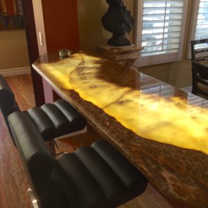
lit-from-inside stone eating bar

lit-from-inside stone eating bar

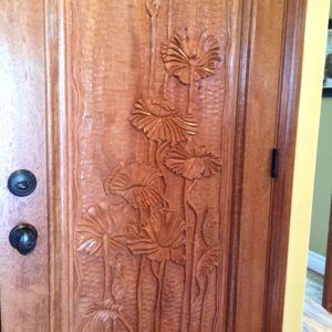
custom carved garage door

custom carved garage door

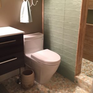
upstairs bathroom. they chose a seafoam green for the shower wall that perfectly compliments the mosaic tile floor

upstairs bathroom. they chose a seafoam green for the shower wall that perfectly picks up the bits of green in the mosaic tile floor

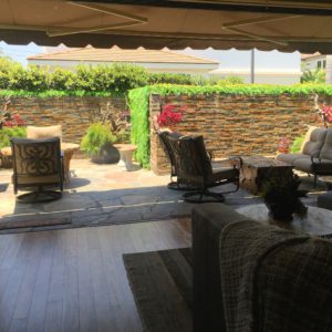
the design of this backyard off of the family room effectively doubles the living space.

the design of this backyard off of the family room effectively doubles the living space.

downstairs bath has the most dramatic sink with an equally impressive faucet.

downstairs bath has the most dramatic sink with an equally impressive faucet.

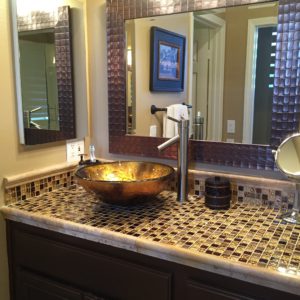
the master bath had two separate opulent tile countertops with gold vessel sinks.

the master bath had two separate opulent tile countertops with gold vessel sinks.

What details have you seen that have caught your eye and stayed in your memory? Let me know in the comments below! And remember, as Charles Eames said: The details are not the details. They make the design.

Have a lovely week,

Ophelia

ooh on black

Yearbook Superlatives

.

With the rapid approach of my high school reunion (never mind which year), I have been strolling down memory lane and marveling at the simplicity and innocence that life once had.  How was it that we were able to sum up our classmates in just a few words? How did we choose, in a graduating class of over 500 people, who had the “best eyes” and who were the “most likely to succeed”? And what does that even mean? In high school, future success was definitely equated with a beautiful spouse, a fast car, and a killer house.  Well, I can’t help you with the spouse or the car, but I can tell you about a few killer houses, in high school yearbook terms.

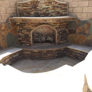
Best Smile You know the category –  maybe it’s “Best Eyes” or “Best Legs”, but it’s the idea that you have one feature so great, you should be in the yearbook for that accomplishment. In theory, someone could actually have the ugliest legs but the best smile and still be featured for that spectacular smile alone. Of course, it never really worked that way, and if you saw the pictures without the captions, you wouldn’t really know which of the superlatives they captured. This week’s “Best Smile” house is 17271 Chatham Lane in the Brightwater area of Huntington Beach. The standout feature of this house is the outdoor space: the backyard and side courtyard.  This particular housing tract doesn’t have the most plentiful outdoor space, so it’s even more impressive what they’ve done with this yard! The whole house is nice, well-decorated, and very livable, but probably wouldn’t win Best Anything in your high school yearbook. But when you combine an attractive home with a Standout Backyard, you suddenly have everyone wanting your autograph.  In this backyard, there was a pool with a baja shelf, a spa with a waterfall into the pool, a built-in barbecue with an eating bar, a lowered fireplace area with built-in seating, and the side courtyard had a built-in raised table, with a fire and ice bowl in the center, and water that cascades down the sides of the base. Impressive! If outdoor living is a priority for you, you enjoy entertaining, and want an extremely low-maintenance exterior, this is your home!

I wish this home were just a tiny bit bigger, with just a bit more space in the side yards between houses, but for the price, I think it is a spectacular buy. I give it an easy 7 hearts out of 10, plus the award of “Best Feature”.  ❤️❤️❤️❤️❤️❤️❤️

built-in barbecue and raised eating counter to the right

built-in barbecue and raised eating counter to the right

a beautiful nook to enjoy an evening by the fire

a beautiful nook to enjoy an evening by the fire

swimming pool and raised spa

swimming pool and raised spa

rich espresso cabinets pair nicely with the stainless steel appliances

rich espresso cabinets pair nicely with the stainless steel appliances

sitting room just off the entry

sitting room just off the entry

a quintessential "house" house; the kind you drew in kindergarten whenever you drew a house and long to call home.

a quintessential “house” house; the kind you drew in kindergarten whenever you drew a house and long to call home.

Most Likely To Succeed Does this honor ever go to someone who hasn’t already succeeded? After all, isn’t past success the best indicator of future success? So the “weird” guy that no one really understood but everyone said was super smart is far less likely to have his picture in the yearbook than the kid who was class president for 3 years running and was captain of the debate team.  3181 Remora Drive in Huntington Harbor is already a winner. It’s on the water with a 40′ boat dock and is in immaculate condition!  However, what really sets this property head and shoulders above the rest is the incredible potential for the price.  Someone is absolutely going to snap this home up and turn it into a masterpiece. This is a lovely home, with lots of outdoor space for entertaining or relaxing. The bedrooms are all upstairs, two with high ceilings and a direct view of the water. The kitchen could use updating, but really has some exciting potential.  This house was sparkling clean and appeared to be in excellent condition.  I need to make friends with whoever latches onto this success story. I’d love to spend some time on that deck, enjoying the water and watching the boats go by.

I give this house 7-1/2 hearts, many of them for pure potential for Success. I would have gone up to 8 if the neighborhood weren’t so tight, and the guest parking situation were a bit easier.

7 and a half hearts

view beyond your own boat dock

view beyond your own boat dock

fire ring and barbecue on the side patio, off the kitchen

fire ring and barbecue on the side patio, off the kitchen

master bedroom fireplace

master bedroom fireplace

living room

living room

view from the living room, through the screen door, out to the waterfront patio. this place could be so spectacular!

view from the living room, through the screen door, out to the waterfront patio. this place could be so spectacular!

Best Dressed   Ah, my favorite… best dressed. This one is controversial because it’s a matter of taste and one person’s Gucci may hold absolutely no appeal for someone else. That kid in Junior High who got “Best Dressed” was soooo preppy (::eye roll::) and all of the surfers were not having it!   I am a huge fan of gallery white walls. White, white, white with pops of color totally makes my day.  I was walking through a boring (in my opinion) taupe-y home with my dad and he said “This is a nice color. At least it’s not that ‘punch-you-in-the-eye white’.” and I was thinking “this just looks dirty”.  So to each his own.  You can’t please everyone.  My winner for Best Dressed of the weekend is 1001 Hampshire Lane in Newport Beach.  I adore absolutely everything about this house, but I really admire that they didn’t “dress it down” for sale and take away the exciting and different touches that make it unique.  If someone doesn’t like a feature, they can change it once they own it, but in the meantime, lets all enjoy the daring unique style of this masterpiece.  I encourage you to look at the listing for the professional shots of this one. My snaps don’t do it justice.  It has bright white walls, dark floors, touches of gold, and really daring wallpaper! Some of my favorite features are the niche for the firewood behind the fireplace, the all glass front door and ingenious front “doorknob”, the onyx fireplace surround (so intriguing you can’t help but touch it), and the spectacular dream backyard.

I love this one immensely, and if it were in my price range I would live there without any hesitation whatsoever.  I give Hampshire Lane 10 hearts out of 10 ❤️❤️❤️❤️❤️❤️❤️❤️❤️❤️

yes, boys and girls, this is the front door!

yes, boys and girls, this is the front door!

view from the top of the stairs, across the sunny living room, and out to the pool

view from the top of the stairs, across the sunny living room, and out to the pool

pool + jacuzzi + fire pit = heaven

pool + jacuzzi + fire pit = heaven

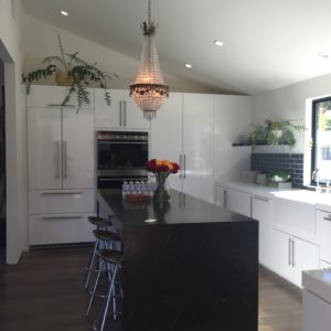
way cool kitchen

way cool kitchen

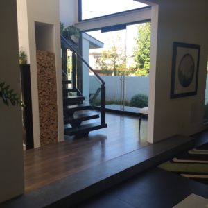
view from the kitchen, past the firewood storage and stairs, toward the front door

view from the kitchen, past the firewood storage and stairs, toward the front door

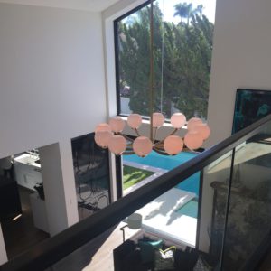
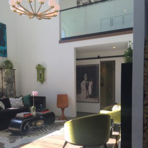
I love this living room so much - the high ceilings, the mcm light fixture, the glass railings above, and all of that sunlight!

I love this living room so much – the high ceilings, the mcm light fixture, the glass railings above, and all of that sunlight!

upstairs bedroom with cool wallpaper and groovy lamp

upstairs bedroom with cool wallpaper and groovy lamp

What sort of personality traits does your house show? Is it winning any awards?  Is it time to look around for one that does? Give Ross a call!

Have a good week and get lots of signatures in your yearbook! I hope you’re having the best summer ever!  Stay sweet,

Ophelia

ooh on black

Wine Tasting

.
ZD Winery

ZD Winery

In early July, for the first time in a LONG time, I had a weekend that did not involve any Open Houses. Of course, that didn’t stop me from looking at properties! I was in Napa for a lovely weekend of wine tasting, but as I drove through the scenic countryside, I couldn’t help but stopping and wandering around the sprawling grounds of a few different properties for sale. What I took away from that weekend (besides the goal that I WILL have a house in Napa one day) was how the concept of wine tasting applies to House Hunting.

When I looked at houses this weekend, I applied the 4 steps of wine tasting.

  1. appearance
  2. aroma or “bouquet”
  3. mouth feel
  4. finish

How do these apply to houses? The first one is a no-brainer… appearance.  Perhaps you’ve already seen pictures online or maybe you’re just driving by and see the sign, but either way, that house’s appearance from the street is going to leave an impression in your mind.  Does it change when you get inside? Are you impressed or disappointed? Perhaps some of each?  Aroma or “Bouquet” doesn’t necessarily just apply to the way the house smells (although that does matter!) but involving all of the senses. How do the floors feel under your feet, how does the light come through the living room windows? Would there be too much sun in the morning?  Is it too warm? Too cold? Is there a nice breeze or a chilly draft? That brings us to #3: Mouth Feel. I’m not recommending licking any houses (although there have been a few that I wanted to give a big hug), so what in the world would this mean?  For me, it’s the livability of the house. Just as you would let a wine roll around on your tongue, let the house roll around in your mind. How does it feel?  Different areas of the tongue are meant to taste differently, just like different areas of the house are meant to live differently.  I’m looking for privacy in a bathroom, but not in a kitchen! I don’t like to feel isolated from the rest of the house when I’m cooking, but I am looking for some alone-time in the bathroom! I don’t like the laundry in the garage (as I’ve mentioned numerous times) but in the kitchen isn’t much better. Say it with me: “the laundry should be where the clothes are kept!”  I like a kitchen sink with a view and a living room with a focal point. I like an office that hides clutter but isn’t too isolated.  In addition to the layout of the house, there is that certain intangible aspect: how does it feel? If you’ve been to as many Open Houses as I have, you’ve felt it all. The good, the bad, and everything in between. How awesome it is, when a house not only functions the way you want it to, but it just feels good?  And finally, the finish. After you’ve rolled it around on your tongue and consumed it, what are you left with?  What are your thoughts as you drive away? What’s the lingering taste in your mind?

One of my Open Houses this weekend that passed the Wine Taste Test with flying colors was 2588 Fairway Drive in Eastside Costa Mesa. The appearance grabbed me right away.  I’m a sucker for a craftsman, and one that appears new, fresh, and in pristine shape is a winner right off the bat. It was just as cute and personable in person as the online pictures. The house engaged all of my senses – it felt clean and well-built. Nothing was shoddy or of questionable quality. There was good light from all of the skylights without any glare or heat.  The layout was excellent, with a laundry room near the bedrooms and a master that opened right onto the backyard.  I especially loved the one upstairs bedroom – what a perfect guest suite to give your guests some privacy and a nice view of the lovely yard! The ceilings were high enough to give a feel of luxury, but not a cold intimidating volume of space. The finish was excellent on this home. I drove away saying “I love this house!” Among the features that stuck with me were the adorable inglenook in the entry, the ginormous kitchen island, the upstairs guest room, and the vast potential in the back yard.  While the neighborhood was nice, it is pretty close to the planes taking off out of John Wayne, so there was some definite noise. Fairway is an easy 8 hearts out of 10, and would be even higher if it weren’t for the location. ❤️❤️❤️❤️❤️❤️❤️❤️

charming exterior

charming exterior

welcoming front porch - i love square columns and quality stonework!

welcoming front porch – i love square columns and quality stonework!

high quality kitchen with a huge center island

high quality kitchen with a huge center island. love the black subway tile behind the stove! the train station clock is an added bonus.

the family room is open to the kitchen and has a cozy fireplace of it's own

the family room is open to the kitchen and has a cozy fireplace of it’s own

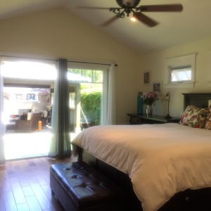
master bedroom with a nice vaulted ceiling, ceiling fan, and the inviting back yard beyond.

master bedroom with a nice vaulted ceiling, ceiling fan, and the inviting back yard beyond.

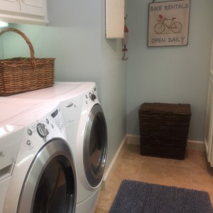
centrally located laundry room with storage! ahhhh!

centrally located laundry room with storage! ahhhh!

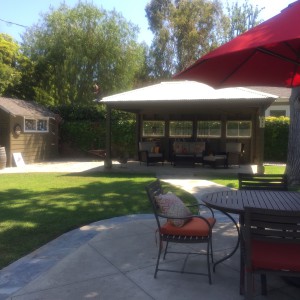
in the foreground, peaceful patio seating, right by the built-in barbecue. at the other side of the yard is a shady cabana and a valuable storage shed.

in the foreground, peaceful patio seating, right by the built-in barbecue. at the other side of the yard is a shady cabana and a valuable storage shed.

this is the spot! If this were my backyard, I would open that '06 pinot that I just bought and enjoy it with someone who has been promising me that such a day will come!

this is the spot! If this were my backyard, I would open that ’06 pinot that I just bought and enjoy it right here with someone who has been promising me that such a day will come!

My other favorite tasting of the weekend was a masterpiece in the Westcliff neighborhood of Newport Beach, 1201 Blue Gum Lane. Appearance: stellar.  Loved the varied roof lines, and the simple but interesting detail of the curved wall in the front yard. Once you open the leaded glass front doors, there is the instant “wow” of a vaulted ceiling, punctuated by glorious skylights, and a truly opulent great room. The high ceilings, natural light, and wide open spaces made the living space richly satisfying.  The master bath and closet were true highlights, as was the well-manicured back yard – complete with koi pond! The kitchen was a little closed-off from the rest of the house and the laundry, while inside, was still pretty far from where the clothes are kept!  Neither of these aspects were a deal breaker, in a space this wonderful. One of the features that left the best taste in my mind as I went on about my day, was the white carrera marble bar at the end of the spectacular entry hall. What a perfect spot for my wine collection!

Blue Gum receives 8-1/2 hearts out of 10. 

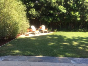
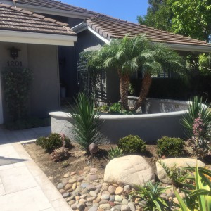
front yard with easy, yet elegant landscaping

front yard with easy, yet elegant landscaping

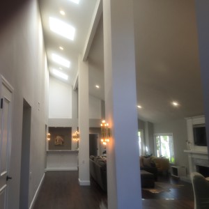
the view from the front door!

the view from the front door!

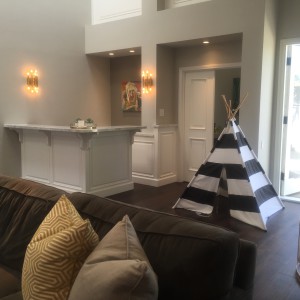
that bar!

there could be some wonderful wine tastings at that bar!

fireplace in the great room

fireplace in the great room, dining room in the foreground

if there's room for a huge ottoman in your bathroom, you're doing pretty well.

if there’s room for a huge ottoman in your bathroom, you’re doing pretty well.

master shower features

master shower features

lovely, low maintenance backyard.

lovely, low maintenance backyard.

What have you tasted recently? What resonates with you and makes you crave more? Please your palate at an Open House this weekend!

Cheers,

Ophelia

 

ooh on black

Touch of Botox or Complete Face Lift?

.

Aging gracefully is not easy. If you’ve waited until signs of age start to show, it may be too late!  If you’ve been meticulous about upkeep from the very beginning, it’s possible to keep a house (yes, a house, what did you think we were talking about?) looking great into it’s later years, but this is truly a labor-intensive process and most people prefer to change at least some aspects of their home every few years to keep up with trends and current styles. Others may wait longer – 10 to 20 years, perhaps – but there still comes a time when a house is showing it’s age and a decision needs to be made, especially if it’s being sold… Botox or full-blown Face Lift?

Older houses have quirks and character. This may be part of their charm, or it may be exactly what you’re looking to eradicate! This week’s houses are both senior citizens, by California standards. One is nearing it’s 70th birthday, and one has already celebrated 100!

521 Seaview in Laguna Beach was built in 1915!  For the most part, you would not guess her age!  She has been lifted and tightened, spackled and sparkled within an inch of her life.  Everything is new-new-new.  You may guess it’s an older home from the smaller rooms and lack of garage, or the slightly quirky layout, indicating add-on’s over the years, but the floors, walls, ceilings, fixtures, and appliances are all new.  They have cleverly done everything possible to make the most of the 1600 square feet, but it is still somewhat tight.  This house is a beauty, with crisp white walls, a high-ceilinged living room, marble counter tops, ocean views, plentiful windows, and surprisingly efficient closets.  For all her beauty, the thing that was missing for me was a sense of history. Most of the character was remodeled right out of her, which may be exactly what you’re looking for!

Seaview’s love-scale will vary wildly, depending on what you’re looking for.  The location is fabulous if you like downtown Laguna, and the finishes are divine, but if I’m going to take on a Centenarian, I think I want more character, more of the original details, lovingly restored.  I give her 7 hearts out of 10.

❤️❤️❤️❤️❤️❤️❤️


great finishes in this kitchen

great finishes in this kitchen

view from the stair landing toward the kitchen and main-level bedroom

view from the stair landing toward the kitchen and main-level bedroom

view past the eating bar toward the front dutch door

view past the eating bar toward the front dutch door

each bedroom had it's own lovely bathroom

each bedroom had it’s own lovely bathroom

master bath - fabulous finishes throughout!

master bath – fabulous finishes throughout!

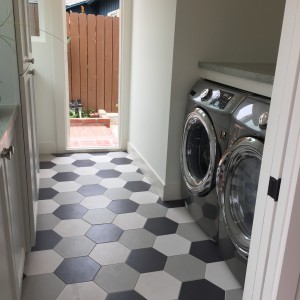
really fun floor in the laundry room!

really fun floor in the laundry room!


2120 Seville Ave, on the Newport Peninsula, was built just after World War II ended, on the end of what was a much-quieter Newport Peninsula!  Make no mistake, Seville Avenue itself is still quite tranquil, but you do have to drive through the congested part to get there, unless you take the ferry from Balboa Island.  Seville has aged gracefully so far, and it’s up to the buyer what direction to take her!  This house oozes history, charm, and potential.  You can feel the stories all around you.  There are pine-paneled built-in benches around 2 sides of the living room.  In their day they were probably full of blankets and board games. The kitchen, while small, is nicely finished, but there is room in the layout of the flipped-plan upstairs to enlarge it to quite the chef’s kitchen! Seville is a quintessential beach girl, relaxed and friendly, encouraging you to invite friends over and cook out on the deck.

So what to do with her? Just a little botox? Freshen up some of the finishes, change out floors and countertops?  Or go all out? Change the downstairs front bedroom with a fireplace into a den that opens onto a new front patio so that you can greet your new neighbors?  Enlarge the kitchen? Change the location of the staircase?  This house is a great size to offer some flexibility of floor plan and there are many inspiring avenues to choose from!  I enjoyed my time in this house. I heard about her history and how she had grown and evolved over the years, as well as hearing some truly inspiring ideas of what could be done when a new family moves in.  How would you help this house realize her full potential?  I might go with the Botox option until I had a chance to get to know her better. Perhaps let her reach her 80th before going all out with a brand-new face.  Check out the next Open House on Seville and see for yourself what could be done, as well as experiencing for yourself how nice it feels to be in a house with history.

Seville is an easy 7 hearts, with potential for much more!

❤️❤️❤️❤️❤️❤️❤️

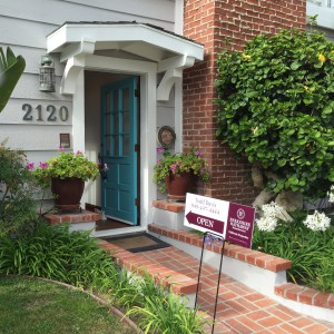
welcome to 2120 Seville

welcome to 2120 Seville

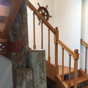
structural elements made decorative with a nautical theme

structural elements made decorative with a nautical theme

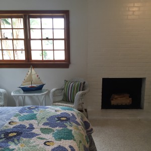
downstairs bedroom with fireplace

downstairs bedroom with fireplace

marble mosaic floor in the bathroom. lovely!

marble mosaic floor in the bathroom. lovely!

spacious outdoor deck

spacious outdoor deck

warm and welcoming living room with windows to catch the breeze from the ocean, just a short stroll away

warm and welcoming living room with windows to catch the breeze from the ocean, just a short stroll away

utterly charming window above the kitchen sink

utterly charming window above the kitchen sink

What’s your aging strategy?

Ophelia

 

ooh on black

Wild Imagination, part II

.

Last week I discussed properties with Potential, (that’s Potential with a  capital P) and how sometimes, “my imagination do go wild” when I’m considering the Possibilities (also with a capital P).  It’s really quite fun to see a place re-imagined in your head and all of the touches that make it work for your life.

You know what else is fun? Looking at houses that are Perfect the way they are! The ones that have ideas and features you’d never thought of and are so impressive that you start composing your first party invite as soon as you step in the door. This level of fantasy, by definition, requires that you go looking outside your price range. It’s not really about making your imagination go wild if it’s a legitimate contender.  Most everyone has some sort of limit to their budget, so step beyond that and see what you see!  And if you don’t have a limit to your budget, please call me, I’d love to be besties.

Anyway, don’t stress on being a lookie-loo. At a trophy property, there is a certain amount of that to be expected. Just behave yourself and don’t touch too many things! 🙂 There are always ideas to gather from these houses, and if you’ve seen it and are talking about it, then you are good PR for the property.

One property that recently sent my imagination into overdrive was 318 Morning Canyon in Corona del Mar. This beautiful property is in the Shorecliffs area of CdM, just south of the village. The house backs to a gully and offers spectacular views across the canyon and down toward the beach. At 4,870 square feet, the house is spacious and airy, and offers huge rooms for both entertaining and relaxing.  It’s a tri-level house with an elevator to access it all. The house is clean and contemporary but warm and friendly. The ceiling in the living room stretches up to the heavens with tons of windows and a limestone fireplace that extends the whole way. The kitchen has bar-seating for 6 and I’ve already used the built-in espresso machine to make all 6 of those lucky friends an imaginary cappuccino while an imaginary chef whips us up some crepes. Downstairs is a bar/kitchenette to serve a huge family room. The deck on the lower level is even bigger than the one on the main level and has a spectacular outdoor kitchen. It’s impossible to pick just one favorite feature of the house, but one of my favorites is the view from the master suite. There is floor-to-ceiling glass, butt glazed at the corner of the room in order to not miss an inch of the view!  A beautiful desk sits in front of that window, but it’s also the first thing you see from bed when you open your eyes in the morning. The master suite also has a limestone fireplace, a sitting area, a sparkling white bath, and copious amounts of closet space.  This house is so big and has such separated and private bedrooms that I’ve already invited several (real) friends to (pretend) move in with me.

This house is completely spectacular, but I do wish there was a pool, or jacuzzi. Completely ignoring the reality of my budget, this house is nearly perfect! I give it 9-1/2 hearts out of 10.

9 and a half hearts


the gorgeous staircase with it's glass jellyfish focal point  next to the spectacular limestone fireplace

next to the spectacular limestone fireplace is the gorgeous staircase with it’s glass jellyfish focal point

this kitchen! clean-lined and anything-but-simple. easy to use for the lucky owner or her caterers.

this kitchen! clean-lined and simple-but-luxurious, easy to use for the lucky owner or her caterers.

downstairs area, well-equipped for the best parties ever!

downstairs area, well-equipped for the best parties ever!

rolling glass door on a secondary bathroom's shower. there are so many high-end, interesting details in this house!

rolling glass door on a secondary bathroom’s shower. there are so many high-end, interesting details in this house!

the master bath has fascinating angles and exciting textures

the master bath has fascinating angles and exciting textures

sumptuous master suite. there it is, to the left of the fireplace...

sumptuous master suite. there it is, to the left of the fireplace… the view!

that view! oh, the blogs ophelia could write from this desk!

that view! oh, the blogs ophelia could write from this desk!

The second of the properties this week that make my imagination go wild is located in Irvine Terrace, at 609 Malabar Drive in Corona del Mar. Even the street name gets my imagination going.  “Malabar” has all kinds of real meanings, but somehow I picture some sort of chocolate delight with marshmallow.  Perhaps that’s just me, but it makes me happy.

There was no marshmallow, (but plenty of rich chocolate brown) at this crisp, clean contemporary house. When I arrived, there was already a substantial pile of shoes outside, indicating that other buyers and dreamers alike had been anxiously waiting the completion of this house to see what was on the inside.  This single story dream house just flowed, one room to the next, inside to outside. An entire wall of glass not only opened up, but vanished completely, making the house feel even bigger than it’s 4,579 square feet. The courtyard entry opened directly into the main living space. The living, dining, and kitchen were one huge room, but due to sheer size alone, each space had it’s own feel.  The artwork was sublime and the finishes were exquisite. Wide (super-wide) french oak plank floors were a clean, warm backdrop for the other textures chosen.  It was easy to pick my favorite feature of this house: the burled  maple used on the impressively-long eating bar, as well as built-in storage in the eating nook and in the hallway to the master bedroom. This wood was so beautiful and different, it really set the house apart.  The floor plan flowed well and there were plenty of skylights so that even long hallways had interest and light. There was a den area (with a GREAT light fixture), near the kitchen, but well-hidden so that you could live a little more casually here. When I walked through there were two little girls happily watching Shrek in the den. They were perhaps 5 and 7 and the younger one said to the older one: “this is a nice house.” The older one half-heartedly agreed but added “there’s no pool.”  She was right (and perhaps she was hoping for marshmallow, too) but there was a substantial yard of “just” grass, serving as a blank canvas for all sorts of landscaping to come! The best of both worlds – perfect enough to send my imagination into “I wish I could move in today” but with future potential to put my own stamp on it as well! Pools, fire pits, cabanas, heat lamps, gardens, water features….  Sometimes my imagination do go wild!

609 Malabar gets 9-1/2 hearts (I’d love to have a little more of a view for my $5.2 Million dollars.)

9 and a half hearts

courtyard entry to 609 Malabar.

courtyard entry to 609 Malabar.

huge viking stove (actual Vikings could feed their army on this!) and lovely marble behind.

huge viking stove (actual Vikings could feed their army on this!) and lovely marble counters and backsplash.

master suite with it's own fireplace and view of the yard.

master suite with it’s own fireplace and view of the yard.

favorite touch - the eating bar against the huge kitchen island.

favorite touch – the eating bar against the huge kitchen island.

more of that beautiful wood, along the sky-lit hallway. who says storage can't be beautiful?

more of that beautiful wood, along the sky-lit hallway. who says storage can’t be beautiful?

the disappearing corner of the living room

the disappearing corner of the living room


You really have to check out the online pictures for this one. Look for the lush glassed-in courtyard in one of the bathrooms! There’s so much to see!  Plus, I’ve been rambling on and on, but you know how it is… sometimes my imagination do go wild!

Ophelia

ooh on black

Sometimes My Imagination Do Go Wild

.

Years ago I had the opportunity to produce some videos for a lovely lady with big ideas. English was not her first language and she had surprising and fun ways of expressing herself. After we completed the first project, she emailed me with grandiose ideas for the next one. She concluded the email with something of an apology/explanation for her ramlbings, saying: “sometimes my imagination do go wild.”  Despite the grammar, it has been one of my favorite sayings ever since, although usually just inside my head.

Which houses make your imagination go wild? You know the ones, where you just can’t stop visualizing what it could be?  Sometimes it’s not even realistic, the dreams you dream, but you let them roll around in your head anyway.

A project is a project and not everyone is down for that.  I always love the idea of it though. because it usually means you’re getting  a better price than a place that’s move-in perfect, and it means the final product is something that you’ve chosen, something that you dreamed up (perhaps with the help of a professional), and something that works for your life, not the last owner’s. I am forever moving walls in my mind and every time I see a tile kitchen I get out my mental safety goggles and sledgehammer.

It’s not every house that makes my imagination go wild; they have to have the potential to be fantastic when I’m finished with them. One of my current favorites is 2100 Baycrest Road in Newport Beach. Oh, the potential! Part of the appeal is that the current owners weren’t afraid to take chances and there is already a great deal of quality finishes and exciting features in the house. Dark floors and walls, high white-beamed ceilings, interesting light fixtures, great artwork, and a gorgeous huge pool in the backyard. Tops on the list of “to do” at this house is increasing the size of the kitchen. It’s a 2,158 square ft house, but the kitchen is proportionally quite small, perhaps 12′ x 12′. Personally, I would annex the formal dining room and be able to double the size of the kitchen!  The “informal” dining room has a spectacular beamed ceiling and is big enough for even a Thanksgiving dinner, so in my world, a formal dining room, which is around the corner from the kitchen and kind of a long trek to make with dishes of food, is just not necessary.  Next on my list of “to do” involves what I thought were some arched windows on the front of the house, giving a somewhat dated appearance.  It turns out the windows are actually square, and the arches are part of a sort of portico in front of the house. I see great potential for doing something awesome here, but I’m not sure what. (This is where the professional comes in…)  There is a cool 70’s-looking arched fireplace that sits on an angle  between the formal living room and the (soon-to-be only) dining room and is shared by both rooms. It could use some updating, but is a nice feature of interest.  There is apparently a cool office/studio in the attic, but the day I visited the house I was wearing a skirt and chose not to climb the ladder to see it! I am intrigued by the online pictures, however, as it certainly appears to be a full-height room.  The house is on the corner of Irvine Avenue and Baycrest Road. Unlike every house I’ve looked at that fronts to Irvine Ave., you barely knew that road was there. There is a large hedge between the driveway and that street, and the garage is the only part of the house that is close to Irvine Avenue. With the front door open, as it is in an Open House, you could hear the road, but with it closed, and even in the backyard, I wasn’t aware of traffic noise at all.  The great thing about 2100 Baycrest Road is that it is totally ready-to-go, and it’s possible to move right in and make those changes as the inspiration strikes.

Currently, I would give the house 7 hearts, but potential and neighborhood bring it up to 8 hearts out of 10 ❤️❤️❤️❤️❤️❤️❤️❤️

the front of the house, as viewed from Baycrest Rd.

the front of the house, as viewed from Baycrest Rd.

fireplace from the dining room side.

fireplace from the dining room side.

the lovely-but-small kitchen

the lovely-but-small kitchen

beautiful huge pool and still room for barbecue and al fresco dining.

beautiful huge pool and still room for barbecue and al fresco dining.

the formal dining room that I would sacrifice for a bigger kitchen. you can see here that the windows are square and the arches are several feet away.

the formal dining room that I would sacrifice for a bigger kitchen. you can see here that the windows are square and the arches are several feet away.

that ceiling, though! and a great light fixture over the informal dining room table.

that ceiling, though! and a great light fixture over the informal dining room table.

Another house that makes my imagination go wild is 16802 Channel Lane in the aquatic paradise of Huntington Harbor. This one is far more of a project but has so much potential!  A true mid-century modern, this house has glass right up to the ceiling (aaaahhhhh!) on a corner lot on Admiralty Island. There is a channel (hence the name: Channel Lane) in front of the house that could be viewed from an easily-added roof deck.  There’s also water behind the house, but the lot does not actually touch the water because of it’s corner location.  It could probably also be viewed from a 2nd story or roof deck.  There was easy access out to Pacific Coast Highway, but no noise from the highway.  The house is older, and currently being rented out, so there are tile floors throughout. I have my mental sledgehammer out already!  The kitchen appears original as well, with old cabinets and tile countertops. It’s a great size already, but could be enlarged if you wanted a really huge kitchen.  The house feels bigger than its’ 2423 square feet. My favorite part is the courtyard/backyard with the pool, which the living room, dining room, and master bedroom all have access to.  This would be a serious remodel, but could be spectacular when completed! Visions of white walls, wood floors, and turquoise or orange mid-century accents all swirled in my head for days on end after viewing it. I mentally built a spiral staircase up to a roof deck with a modern glass railing all around it.  In the long-term, I would love to have a sumptuous master suite up there with views of water in two different directions. I also went so far as to let my imagination smooth out the stucco exterior to have smooth plaster.  I imagine great indoor/outdoor parties and keeping the doors open for breezes without worrying about the cat getting away because of the high wall around the whole “compound”.

If i give out hearts purely for potential, it would probably be 8.5-9, but because it would take quite a bit of effort to get there (effort = dollars), i’ll keep the hearts to 8 ❤️❤️❤️❤️❤️❤️❤️❤️


pool with nice pavers all around

pool with nice pavers all around

super original and mostly cool master shower. love the terrazzo, wouldn't mind replacing the glass and the shower head.

super original and mostly cool master shower. love the terrazzo, wouldn’t mind replacing the glass and the shower head.

master bedroom with a view of the pool

master bedroom with a view of the pool

living room with the entry beyond

living room with the entry beyond

Stay tuned because next week’s entry is more of what makes my imagination go wild… this time for a different reason – they are complete FANTASY houses!  Listen to your imagination this week and ask yourself: What makes your imagination go wild?


Ophelia

ooh on black

The After-Burn

.

You know that feeling when you get too much wasabi? After you survive the initial bullet to your brain, you think you’re in the clear but then the burn continues to disintegrate the bridge of your nose and deter you from your hamachi for another ten minutes. You know what I mean? Yeah, I love that feeling!

On a grander scale, there are some houses that have The After-Burn. You see it and think “whoa, this place is great.” but then you find that you are still thinking about it, even three open houses later.  You fall asleep thinking about a certain feature of the house and it creeps back into your thoughts during your morning commute. It may not even be the best house you’ve ever seen, but there’s something about it that continues to burn in your thoughts.

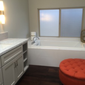
My After-Burn houses this week are quite different from each other, and in different cities. The first is in the Baycrest community of Newport Beach. 1915 Santiago grabbed my attention with it’s online pictures, but I thought the outside appeared a little dated. When the day of the Open House came, I was very pleased to see that the outside was actually very nice, with slate hardscape, a gorgeous round planter with succulents and a palm tree, and potential for an entry courtyard. The inside was just as gorgeous as I’d hoped, perhaps even more so. There was a mid-60’s sunken living room, but tastefully updated with great built-ins for the TV and books, a cool mid-century fireplace, and daring charcoal walls. Opposite the living room was a wall of glass that kept the whole room light and airy.  This house had a wonderful floor plan and a big, open kitchen-dining-family room area. The bedrooms were generous, although I’m always in search of a bigger closet. To top it all off, 1915 Santiago had a big, beautiful backyard, with a grassy area, a variety of places to sit and enjoy the day, and a beautiful pool and jacuzzi! Every finish they chose was beautiful, from the wide-plank wood floors, to the clean white kitchen with light granite counters, and the zen-like master bath.  But my absolute favorite detail was the white textured tile entry wall. The only drawback to this lovely home was that the laundry was in the garage, a personal downer for me.  The features that continued to burn in my mind were that entry wall, the formal living room, the walls and walls of glass looking out to the lovely backyard, and the way the entire plan flowed.

I give it 8 hearts out of 10 ❤️❤️❤️❤️❤️❤️❤️❤️

stylish planter sits between the 3-car driveway and the walkway to the front door.

stylish planter sits between the 3-car driveway and the walkway to the front door.

oh, this living room! i love the built-in for the tv that separates it from the entry but keeps it feeling open

oh, this living room! i love the built-in for the tv that separates it from the entry but keeps it feeling open.

the kitchen looks out over the picturesque backyard and has easy access to the dining room.

the kitchen looks out over the picturesque backyard and has easy access to the dining room.

the pool is nestled into the corner of the yard and has a jacuzzi and a little baja shelf. What could be more perfect?

the pool is nestled into the corner of the yard and has a jacuzzi and a little baja shelf. What could be more perfect?

The other burn-inducing house I had the privilege to visit this weekend was in Seal Beach. This was a typical narrow-lot (25′) beach dwelling on a quiet street in Old Town with an 84 walk score. Seal Beach is quaint and fun and cleaner and calmer than many beach towns.  While I love the town, 242 5th Street was an atypical choice for me because of it’s exterior. I’m not a fan of mediterranean, tile roofs, or masonry balustrade railings.  The interior, specifically the upstairs, won me over.  This was a flipped floor plan, with living, dining, kitchen, family room, and a bedroom and 1.5 baths all on the second level! This was a smart way to address the small-footprint issues of these beach lots. By using the second story for these rooms, you can include square footage that you would have lost to the garage on the first level. The other huge advantage is that you can vault the ceilings and include skylights, which was far and away the feature that continued to burn with me the most.  I simply couldn’t stop thinking about those ceilings!  For me, a certain amount of after-burn was also triggered by the fact that there were cosmetic aspects that didn’t appeal to me, so I continued to think and think how I could make this house feel more contemporary. Different balcony railings as well as interior banisters would go a long way to giving the place an updated feel. There were many plusses to the house as well.  There were great storage areas (big pantry in the huge kitchen) and a wonderful roof deck with outdoor kitchen.  Each bedroom had it’s own bathroom and the master closet was Ophelia-Approved!!

This house would be a 6 as-is, or worth 7 hearts with some cosmetic changes. ❤️❤️❤️❤️❤️❤️

first floor view from the hallway toward the front door, master suite door, and stairs to the second story

first floor view from the hallway toward the front door, master suite door, and stairs to the second story

the master suite is on the first floor at the front of the house and has a lovely fireplace.

the master suite is on the first floor at the front of the house and has a lovely fireplace.

the view across the dining room and spectacular two-story entry toward the living room. Oh, that ceiling and those skylights!

the view across the dining room and spectacular two-story entry toward the living room. Oh, that ceiling and those skylights!

spacious and bright kitchen with a view toward the front of the house.

spacious and bright kitchen with a view toward the front of the house.

the family room has it's own fireplace and is situated just off the kitchen and nook. stairs lead up to the 1,000 square foot roof deck!

the family room has it’s own fireplace and is situated just off the kitchen and nook. stairs lead up to the 1,000 square foot roof deck!

What did you see this weekend? Which ones faded away and which continued to burn in your mind? Thank you for reading, I have to get back to my hamachi now.

Ophelia