When it comes to houses, there are the big things – like location, price, size, and floor plan – and then there are the details. Ah, the details. Small by definition, but they make such a big impact. There is the general rule of thumb that as the price increases, so do the details, so the exceptions to the rule are always a refreshing find in an open house weekend.
Have you ever just raced through an open house because there is literally nothing to look at? Square or rectangular rooms, flat ceilings, ho-hum closets, boring bathrooms… No chances taken anywhere, architecturally or design-wise. Maybe the materials are nice but the same in every room, and the same as the last house, and the one before. You turn corner after corner hoping for a bit of life, but… *sigh*… flatline.
By contrast, there are houses where you hardly know where to rest your eye. This doesn’t mean they are busy or even cluttered, it just means that there are details. Even in a sleek, modern design, there can be thousands of exciting details. When I fantasy shop (in the $38M range) (what, doesn’t everyone do this?) there are usually multitudes of heavenly details. Take a look at this listing for 1201 Laurel Way in Beverly Hills. Go ahead and try to pick a favorite feature. I dare you.
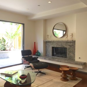
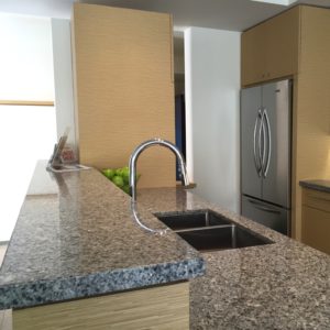
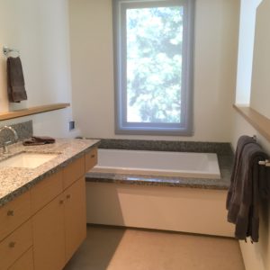
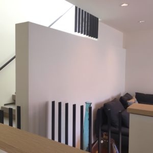
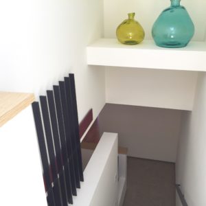
In a slightly more reasonable price range, I have two to share with you. (And again, if $38M is reasonable to you, call me, we need to hang out.) One property I visited that boasted great attention to detail was 3240 Broad Street in Newport Beach; two newly constructed townhomes, identical but reversed, in the Newport Heights area. These contemporary dwellings, designed and built by architect Renato Trotta, are each 1900 square feet of quality details. The materials used have variety, but a thoughtful repetition. For instance, the exterior window ledges match the patio below to give a sense of continuity. The kitchen has a limestone floor while the living and dining are both wood. They come together on a graceful angle, giving a feeling of “custom” not “builder”. There is a brushed marble hearth, raised to an appropriate sitting height (a must, in my opinion, so that you can sit right by the fire). This hearth shares that same angle, and actually “floats” a few inches away from the fireplace. The outlets in the kitchen are not in the backsplash wall, but are actually up in the bottom of the upper cabinets: convenient and accessible, but discreetly hidden from view. There are no baseboards in the house. The drywall hovers just above the floor. You simply can’t pull off this look unless your drywall work is of the highest quality! One of my favorite features in the house are the openings in the walls. At the end of the galley kitchen there is an opening to the staircase leading upstairs and toward the garage. It removes the “trapped” feeling one might experience at the end of the kitchen, and creates a feeling of connection to the rest of the house. Upstairs in the loft, there is a pony wall around the staircase coming upstairs, capped in the same light wood as the rest of the cabinetry in the house. This wall stops and becomes a metal railing for about 30 glorious inches, consisting of only vertical supports, no horizontal top! It’s delightful and unexpected and pops up in a few places throughout the staircase area. It’s difficult to do it justice in words. Be sure to check out the listing or this video. You will marvel at the detail in this home – variated ceiling heights, cut-outs in the drywall above each and every stair, showers with a gentle slope toward a stepped-down drain, the raised walkway in the garage toward the hidden laundry. You know how I feel about garage laundry, but they did the best they could in this situation. Because of the orientation of the laundry, and the smartly placed wall, you don’t feel that you are really in the garage doing laundry, and when you drop your clean socks on the way back in the house (arghhh!) , at least they aren’t on the garage floor.
I love the feeling of quality in this home. I love the surprises and the details. I wish it were just a tiny bit bigger, if for no other reason than to get the laundry inside (and possibly upstairs). There’s a little bit of up and down with the layout of the stairs between the garage and powder room and the rest of the house, and the neighborhood is a bit transitional (but still boasts a fabulous ocean view) but those were really my only drawbacks. The two homes really are spectacular and special and unique. You don’t often find quality like this in new construction unless you’ve built it yourself. I give these Broad Street townhouses 9 hearts out of 10. ❤️❤️❤️❤️❤️❤️❤️❤️❤️
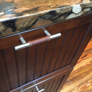
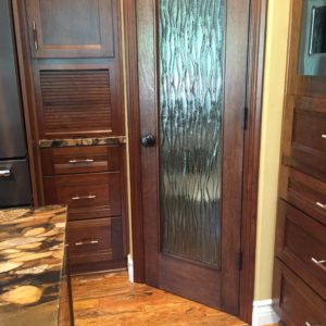
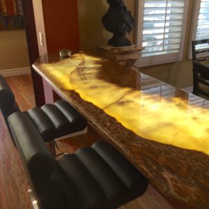
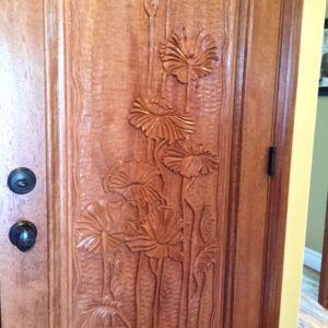
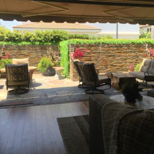
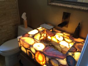
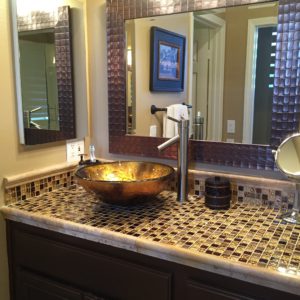
The second house of the weekend whose details drew me in was 2633 Orange Ave. in Costa Mesa. Built in 1999 and impeccably maintained, this home is the epitome of move-in ready. There are designer touches throughout and the outdoor space is incredible. There are 16 feet of slate walls of water and greenery covering every other surface. The family room glass pocket doors vanish, causing indoor and outdoor to easily mingle. If you want a screen to keep bugs out or pets in, one appears from the ceiling like magic. The kitchen has a great layout, with room to work, lots of counter space, a walk-in pantry, and room for two people to cook. The surfaces chosen are surprising and interesting. There’s nearly a cacophony of patterns with the dotted backsplash, the unique circle-pattern granite, and the multi-color “mardi gras” floor, but somehow it all works. There are leather-wrapped cabinet pulls and a wavy glass door on the pantry. Every bathroom except the master had the same layout, but each had it’s own unique materials. Downstairs the sink was very dramatically lit from inside, causing the stone to glow! This glowing stone was also featured in an eating bar between the kitchen and the dining room. There was a beautiful carved door into the garage as well. It is evident from the neighborhood that the nine houses on this cul-de-sac were all built at the same time, falling into that “builder home” category. Once inside this lovely home, it feels completely custom, adored and celebrated by it’s owner.
I loved the layout of the home and the well-chosen, high quality details. If I were making wishes, I would wish it were a little farther from the airport, with a little more exterior space in both the community and the yard, and I wish the exteriors weren’t quite so… “faux mediterranean”. They aren’t un-attractive, but it’s not my favorite style. I would also wish for a fireplace, although there is a gas fire pit outside. Even with my wishes un-granted, it earns an easy 8 hearts. ❤️❤️❤️❤️❤️❤️❤️❤️
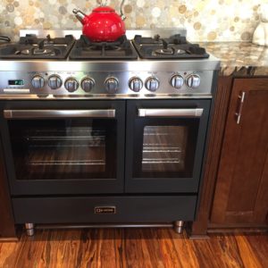
viking stove, surrounded by exciting finishes
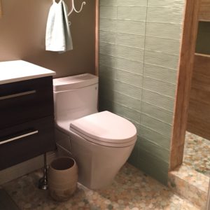
upstairs bathroom. they chose a seafoam green for the shower wall that perfectly picks up the bits of green in the mosaic tile floor
What details have you seen that have caught your eye and stayed in your memory? Let me know in the comments below! And remember, as Charles Eames said: The details are not the details. They make the design.
Have a lovely week,
Ophelia

